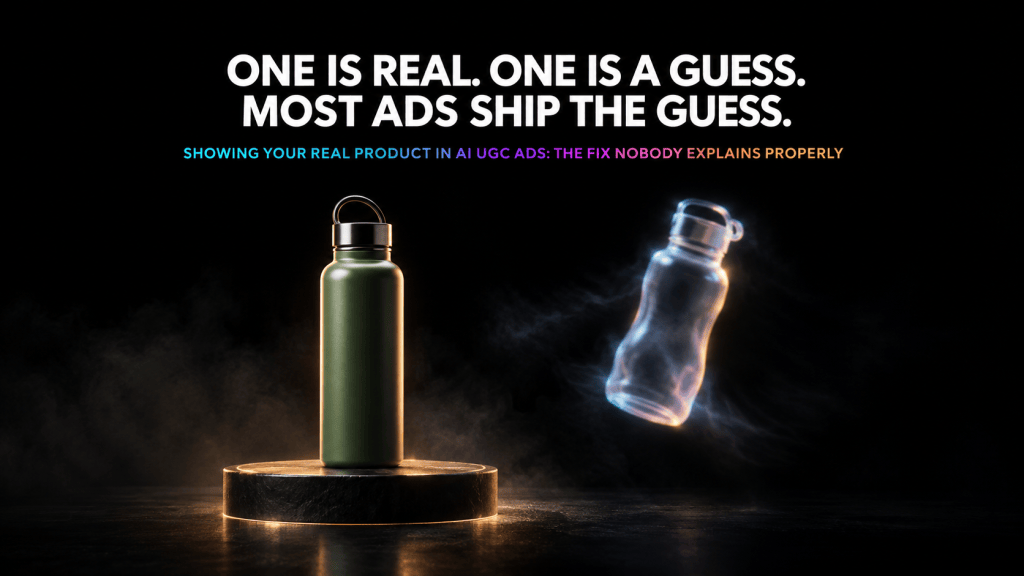
Scroll through almost any forum discussing AI UGC tools, and one complaint shows up more than any other. The avatar looks fine. The script reads fine. But the product itself doesn’t quite look like the real thing.
Most content mentions this limitation briefly and moves on. This piece exists to actually fix it. If you’re running ai ugc ads and your product looks slightly off every time, the fix is simpler than most people assume.
Why This Complaint Keeps Circulating Without a Clear Answer
Sometimes the label text is subtly wrong. Sometimes the shape is close but not exact. Sometimes it’s just the color, a shade off from the real packaging. Nobody’s connected this recurring frustration to an actual, fixable cause, so it just keeps circulating as a vague, accepted limitation.
The Actual Root Cause
If a script or prompt describes a product only in words, “a blue serum bottle with a white cap,” the AI has no choice but to invent every visual detail beyond that description. Exact shape. Exact label placement. Exact shade of blue. None of that specific information exists in a text description, so the model fills the gap with a generic approximation, not your actual product.
This isn’t a flaw in any specific tool. It’s a structural limitation of generating from words alone rather than an actual visual reference.
The Single Fix That Solves Most of This
Providing an actual reference image of your product changes this equation almost entirely. Tools supporting reference-image-based generation use that image to anchor shape, color, and label details directly, rather than inventing a generic version from scratch.
This one step, uploading a real photo before generating anything, resolves the majority of product-accuracy complaints. It’s the exact step most brands skip because it requires one extra minute of preparation.
How to Capture a Usable Reference Image
A usable reference needs even lighting that doesn’t obscure label detail in shadow. It needs at least one angle showing branding clearly, not at a steep angle where text distorts. Multiple angles, front, side, and a label-facing close-up, give the model considerably more to work with than a single distant shot.
A phone camera in good lighting is genuinely sufficient. The goal is clarity, not studio production value.
Why Label Text Still Needs a Manual Check
Text rendering has historically been the weakest point across AI generation broadly. Newer models have improved considerably, but “improved” doesn’t mean solved universally. Before publishing, zoom in on any moment the label is visible and confirm the text is legible and accurate, not just present.
Why the Problem Compounds Across Multiple Videos
This detail matters once you’re producing more than a handful of ads for the same product. Without a fixed reference reused consistently, successive videos can drift further from each other, not just from the real product, since each generation is essentially reinterpreting the product from scratch rather than working from the same locked source.
Lock in one strong reference image per product and reuse that exact image across every generation, rather than treating each new render as an independent creative decision.
Camera Motion Choices That Reduce Drift
A product held steady in a closer shot renders more reliably than one being tossed or spun rapidly. Fast motion gives the model more opportunities to introduce visual drift between frames, since maintaining consistency across rapid motion is a harder rendering problem than a static shot.
The Hybrid Approach Worth Considering
For brands where accuracy matters most, supplements with regulated labeling, jewelry with fine reflective detail, using a real, high-resolution photograph as the anchor reference, then generating the surrounding performance around it, produces the most reliable result available.
When to Regenerate Instead of Accepting a Flawed Take
If a first-pass generation shows drift from the reference, color shifted, shape off, regenerating with the same reference image is almost always worth the extra few minutes. The underlying reference hasn’t changed, only the specific render has, which often resolves the drift entirely.
Which Categories Are Hardest
Products with fine printed detail, ingredient lists, small warning text, tend to be hardest, since legibility at a small scale is harder than reproducing a large logo. Reflective products, jewelry, glass bottles, introduce a separate challenge, since reflection consistency is a distinct rendering problem from shape accuracy.
When This Becomes a Compliance Problem, Not Just a Visual One
A supplement label rendering with incorrect or illegible required text isn’t just a visual imperfection, it can create genuine labeling compliance exposure. A product shown with a different apparent formulation than what’s actually sold risks the ad itself being misleading, independent of anything the spoken script claims.
Why Commerce Platforms Raise the Stakes Further
On a standard ad, a viewer might click through to a separate product page showing accurate photography. Commerce-integrated formats remove that safety net, since the viewer may be purchasing directly from what they’re seeing in that exact moment.
A Pre-Publish Checklist
Confirm a real, multi-angle reference image was used. Confirm label text is legible wherever visible. Confirm color and shape match the reference consistently throughout the clip, not just the opening frame. Regenerate if any drift showed up in the first pass.
The Bottom Line
The fix for this widely complained-about limitation isn’t a better tool. It’s one extra step most brands skip, providing a real reference image instead of trusting a text description to reproduce your actual product accurately.
Why Nobody Connects the Complaint to the Fix
It’s worth understanding why this specific gap persists so widely across forum discussion. The complaint itself is easy to notice, anyone looking at a finished ad can see the product looks slightly off. The cause is much less obvious, since it requires understanding something about how generation models actually work internally, that they can only reproduce what they were given as input, not what the creator had in mind when writing a prompt.
Most people encountering this problem for the first time assume it’s a limitation of the specific tool they’re using, prompting them to try a different platform rather than fix the actual input. This explains why the same complaint shows up across discussions of nearly every AI UGC tool on the market, since the root cause travels with the missing reference image, not with any single platform’s specific technology.
A Closer Look at Why Text Descriptions Fail So Consistently
It helps to walk through exactly what happens when a model receives only a text description. The words “blue serum bottle” activate the model’s general understanding of what serum bottles typically look like, built from an enormous number of examples it learned from during training. That general understanding is genuinely useful for producing a plausible-looking serum bottle. It is not useful for producing your specific serum bottle, since your product’s exact proportions, label design, and cap shape are not encoded anywhere in those three words.
This is why the resulting product often looks reasonable in isolation, plausible enough that someone unfamiliar with the real product might not immediately notice anything wrong, while still being noticeably inaccurate to anyone who actually owns or has seen the genuine item. The model isn’t failing at its job. It’s succeeding at the only job a text-only prompt actually gave it, produce something plausible, not reproduce something specific.
What Actually Changes Once a Reference Image Enters the Process
A reference image gives the model something a text description structurally cannot, direct visual data about your product’s actual proportions, label placement, and color values. Rather than reconstructing a serum bottle from a general pattern, the model has a concrete visual anchor to work from, dramatically narrowing the range of plausible outputs down toward your specific product rather than any generic version of the category.
This is precisely why the fix described throughout this piece works as consistently as it does. It isn’t asking the model to do something fundamentally new. It’s simply giving the model the specific information it needs to do the thing it was already capable of doing accurately, once that information is actually available to it.
Why More Reference Angles Genuinely Help, Not Just One Good Photo
A single reference photo, even a good one, only shows the model one specific viewpoint of your product. If the finished video needs to show the product from a different angle than the reference photo captured, the model still has to extrapolate that unseen angle, reintroducing some of the same uncertainty a text-only approach would have created entirely.
Multiple reference angles reduce this extrapolation considerably, since the model has actual visual data covering more of the product’s real appearance rather than needing to guess at whatever wasn’t directly captured in a single photo. This is exactly why a front shot alone, however clear, doesn’t fully solve the problem the way front, side, and label-facing angles together tend to.
The Practical Cost of Skipping This Step
It’s worth being direct about what skipping this step actually costs in practice, beyond just a vague sense that something looks slightly wrong. A viewer who notices the product doesn’t quite match what they’d expect from the brand, even without being able to articulate exactly why, experiences a small but real dent in trust toward the ad as a whole. That dent doesn’t need to be dramatic to matter, since advertising already operates on thin margins of attention and credibility, and a subtle “something’s a little off” reaction is often enough to reduce how persuasive an otherwise well-made ad actually turns out to be.
Given that the actual fix costs a single extra minute of photographing the product before generating anything, the cost-benefit calculation here is genuinely lopsided in favor of just doing it consistently.
Building This Into an Actual Team Habit
For any team producing AI UGC content at real volume, the practical solution isn’t remembering to do this occasionally when someone happens to think of it. It’s building a simple, standing rule into the production process, no generation begins without a locked reference image already prepared and available for that specific product, the same way a script doesn’t get approved without a claims review in more sensitive categories.
This kind of small, consistently applied rule compounds meaningfully over a large content library. A single missed reference image is a minor issue. The same gap repeated across dozens of ads for the same product, because reusing a locked reference never became a genuine habit, produces a noticeably inconsistent body of content that’s harder to fix retroactively than it would have been to prevent from the start.
What This Means Going Forward
As AI video and image generation models continue improving their underlying capability, it’s reasonable to expect some of this gap to narrow on its own, models becoming somewhat better at inferring accurate product details even from imperfect input. That improvement, whenever it fully arrives, doesn’t change the practical advice for right now. Providing a genuine reference image remains the single most reliable, immediately available fix for a problem that otherwise shows up in nearly every serious discussion of this format’s current limitations.
A Worked Comparison Showing the Actual Difference
It helps to picture two versions of the same generation attempt side by side. Version one starts from a text prompt alone, “a supplement bottle, white with a green label, standard pill bottle shape.” The resulting video shows a plausible supplement bottle, reasonably proportioned, roughly the right color scheme, but with label text that reads as generic filler wording rather than the brand’s actual product name, and a cap shape that’s close but not identical to what the brand actually ships.
Version two starts from the same basic prompt, but with three reference photos attached, front, side, and a close label shot. The resulting video shows the brand’s actual label text rendered legibly, the correct cap shape and color, and consistent proportions matching the real product across the entire clip. Both versions technically followed the same underlying instruction. Only one actually produced the brand’s real product rather than a plausible stand-in for the general category.
Why This Matters More as Testing Volume Increases
Teams testing many creative variations per week specifically benefit from solving this once, upfront, rather than repeatedly. A locked reference image, once captured and confirmed to work well, gets reused across every subsequent script variation and format test for that same product, meaning the one-time cost of capturing a good reference photo pays off across dozens of future generations rather than needing to be solved fresh each time.
This is really the core argument for treating reference image capture as a standing production step rather than an occasional afterthought. The investment is genuinely small, and the payoff compounds directly with however much testing volume a brand is actually running for that specific product going forward.
Where to Start If You’re Reviewing Your Own Content Right Now
If you’re currently producing AI UGC content without a consistent reference image practice in place, the fastest way to see whether this actually affects your own results is pulling three recent videos of the same product and comparing them side by side against a real photo of that product. Check whether the label text, shape, and color stay consistent across all three, or whether each one drifted slightly differently from the real item and from each other.
Most people running this exact comparison for the first time find a gap they hadn’t consciously noticed before, since a single video reviewed in isolation rarely looks obviously wrong. It’s only once you compare multiple renders directly against the real product, side by side, that the actual pattern becomes clear enough to act on.


Leave a comment