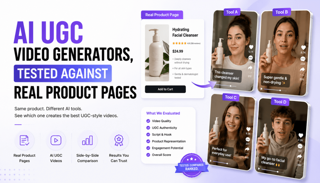
Every AI UGC video maker looks convincing in its own demo. That’s the problem with judging a tool from its landing page — the sample product photos are chosen because they work well with that specific model. The real test is whether it holds up with a product photo pulled straight from your own store page: inconsistent lighting, a cluttered background, a product that isn’t a bottle or a t-shirt.
That’s the test that actually matters, so that’s the one we ran. Below is what happened when we fed real product images — not curated demo assets — into a handful of the more prominent AI UGC video maker tools, and what that revealed about where each one is genuinely strong.
Why Testing Against Real Product Pages Matters
Demo videos on a tool’s homepage are optimized for the demo, not for your product. A skincare brand and a hardware brand don’t photograph the same way, and a tool that handles one cleanly can fumble the other — inconsistent shadows, a product edge that doesn’t composite well, or an avatar that visually competes with the product instead of framing it.
The gap shows up most in three places:
- Background handling — does the tool clean up a busy product-page background, or does it just layer an avatar on top of it?
- Product framing — does the product stay the visual focus, or does the avatar’s motion pull attention away from it?
- Consistency across variants — if you generate five versions from the same product photo, do they stay visually coherent, or does quality swing between attempts?
None of this shows up in a curated demo. It only shows up when you run your own asset through the tool.
What We Actually Tested
We used product photos pulled directly from live e-commerce listings — not stock photography, not the tools’ own sample libraries — across a mix of categories: a skincare bottle, a piece of apparel, and a small electronics accessory. Each photo went through the same basic prompt structure: a short script, a requested mood, and (where the tool supported it) a style reference for color grade.
The goal wasn’t to crown a single winner. It was to see which tools handle unglamorous, real-world input well, and which ones need cleaner assets than most brands actually have on hand.
Tagshop AI
Fed a real product photo with visible background clutter, Tagshop AI’s AI UGC video generator kept the product as the visual anchor instead of allowing the avatar to dominate the frame. Combining the product photo with a style reference during the same generation step made a noticeable difference—the tool didn’t have to guess the desired mood from text alone; it had a visual reference to follow.
Where it needed a second pass: with the electronics accessory, the first generation slightly oversaturated the background color picked up from the style reference. A simple plain-language edit—“tone down the background color”—fixed the issue without requiring a complete regeneration. That in-place editing workflow proved useful for making quick creative adjustments.
Read on real photos: Tagshop AI handled busy product backgrounds better than expected when a style reference was included. The main limitation was a slightly saturated color grade, which was easily corrected with one additional edit.
HeyGen
HeyGen’s strength showed up less in the product framing and more in voice and lip-sync quality — even on a script that wasn’t written for translation, the delivery sounded natural rather than flatly synthetic. That said, its workflow is built more around a presenter-led format than product-centered UGC, so the apparel and skincare shots ended up feeling more like a person holding a product than a native social post about the product itself.
Read on real photos: strongest voice and delivery quality of the group; product framing felt secondary to the presenter.
Synthesia
Synthesia’s template-driven workflow showed its corporate roots clearly once a real, slightly messy product photo was in the mix. The output was clean and professional, but it read as a training-video aesthetic rather than a UGC ad — the polish worked against the “shot on a phone” look that UGC ads are supposed to have.
Read on real photos: technically clean, but tonally mismatched for social ad formats regardless of input quality.
D-ID
Since D-ID works from a single photo rather than requiring existing video, it handled the electronics accessory shot reasonably well — no background clutter issue, since the tool’s strength is animating a portrait-style image rather than compositing a product scene. It’s a better fit for animating a person’s photo than for product-centered UGC specifically.
Read on real photos: solid for photo-to-talking-video on a person; not really built for product-scene compositing, so this comparison stretched it outside its core use case.
Creatify
Creatify’s automated approach — generating from a product URL rather than a manual input step — meant less control over exactly how the messy background got handled. On the apparel shot, the automation chose a crop that cut off part of the product, which a manual input step likely would have avoided. Speed was genuinely good; precision took a hit in exchange.
Read on real photos: fastest to a first draft; least consistent framing accuracy without manual adjustment.
What This Testing Actually Revealed
The tools that let you add a style reference alongside the product photo consistently handled real, unpolished input better than the ones working from text description alone. That’s not a small detail — it’s the specific feature that determines whether messy real-world photos produce usable output or need heavy manual correction afterward.
Presenter-first tools (HeyGen, Synthesia) delivered stronger voice and lip-sync quality but weaker product framing, because that’s not the problem they were built to solve. Product-first tools (Tagshop AI) handled framing and background better but aren’t trying to compete on presenter realism as the primary feature.
Fully automated tools (Creatify) traded control for speed — a fair trade if you’re testing volume of concepts, a worse one if precision on a specific product shot matters.
How to Run This Test Yourself
Don’t take any comparison, including this one, as a substitute for testing your own assets. Here’s the version worth running before you commit to a tool:
- Pull an actual product photo from your live store — not a studio shot, not a stock image. Use whatever your average listing photo actually looks like.
- Write a real script, not a placeholder. Vague test scripts produce vague results that don’t tell you much.
- Add a style reference if the tool supports it. This is the single feature most likely to separate usable output from generic output.
- Generate the same input across two or three tools and compare side by side, not sequentially days apart — memory of the first result skews how you judge the second.
- Check whether fixing a flaw requires a full regeneration or an edit. This affects cost and turnaround more than almost any other factor once you’re producing at volume.
What Category-Specific Testing Actually Looks Like
Before getting into more tools, it’s worth breaking down what “real product page” testing means by category, because the failure points aren’t the same across industries.
Skincare and beauty. Bottles and jars are reflective, which means lighting inconsistency shows up fast. A tool that composites poorly will produce a visible seam where the product meets the background, especially if the original photo has a glossy highlight the model doesn’t know how to preserve.
Apparel. Fabric texture and how it moves (or doesn’t move) is the tell. Static apparel shots that get animated sometimes produce stiff, unnatural draping — the fabric doesn’t respond to the avatar’s motion the way real fabric would.
Electronics and hardware. These products have hard edges and consistent geometry, which sounds like it should be easier, but it means any warping or edge distortion is immediately obvious. There’s no soft material to hide an imperfect composite.
Food and beverage. Color accuracy matters more here than in almost any other category — a color-graded video that shifts a product’s actual color even slightly reads as inaccurate in a way viewers notice, even if they can’t articulate why.
Keeping these category differences in mind changes how you read any comparison, including this one. A tool that handles skincare well isn’t guaranteed to handle hardware the same way.
Colossyan
Colossyan’s branching-video logic — built for compliance and training content — doesn’t map onto product-page testing in an obvious way, but we ran it anyway because some brands use it for internal sales-enablement content featuring real product shots. The result was consistent with its design intent: clean, professional, but visually closer to a training slide than a social-native ad. On the apparel shot specifically, the avatar’s positioning felt template-driven rather than composed around the product.
Read on real photos: solid for internal-facing content; not built for and doesn’t compete well in social-ad framing.
Elai.io
Elai’s slide-to-video workflow meant our test had to route around its core strength — we fed it a product photo directly rather than a slide deck, which isn’t the intended entry point. Output was serviceable on the electronics accessory, where geometry was simple, but showed rougher edges on the apparel shot where fabric and background required more nuanced compositing.
Read on real photos: works best when fed through its intended slide-based workflow; direct product-photo input is a secondary use case, and it shows.
DeepBrain AI
DeepBrain’s anchor-style avatars are built for formality, and that came through clearly. On the skincare bottle, the presenter’s tone and framing felt more like a product announcement from a company spokesperson than a UGC-style recommendation — technically polished, but working against the casual, native-feeling tone that makes UGC ads perform on social platforms in the first place.
Read on real photos: high polish, consistent lip-sync; tonal mismatch for casual UGC formats persists regardless of input quality.
Vidnoz
Vidnoz aims for a lower-cost, faster entry point into the category, and that tradeoff was visible in our test. Generation was quick, but background handling on the cluttered apparel shot was the weakest of the group — the tool appeared to apply a generic blur rather than genuinely compositing around the product, which left a visible mismatch between the product’s sharpness and the softened background.
Read on real photos: fast and inexpensive; background compositing was the clearest weak point in this round of testing.
Pricing Considerations Once You’ve Narrowed the Field
Speed and framing accuracy matter, but cost per usable clip is the number that determines whether a tool actually fits your production volume long-term.
A tool that’s cheaper per generation but requires two or three regenerations to get a usable result isn’t actually cheaper. Factor in the realistic number of attempts a tool needs to produce output you’d publish, not just its sticker price per clip.
Subscription tiers with unlimited or high-volume generation caps make more sense for teams producing daily variants; pay-per-generation pricing can work fine for occasional or seasonal campaigns where volume is low and predictable.
Watermark-free export and commercial licensing terms are worth checking directly — some lower-tier plans across this category restrict commercial use or add watermarks that quietly limit which plan is actually usable for paid ad placement.
Common Mistakes Brands Make When Testing These Tools
Testing with a cleaned-up hero shot instead of a typical listing photo. If your actual catalog photos are inconsistent, test with an inconsistent one — testing with your best asset tells you the tool’s ceiling, not its typical real-world output.
Judging quality from a single generation. Output quality on these tools can vary between attempts with identical input. Run the same input two or three times before concluding a tool is consistently strong or weak.
Ignoring how a tool handles rejection or correction. Not every generation lands. What matters is whether fixing it costs you a full regeneration or a quick edit — this is a bigger long-term cost driver than most brands account for during initial evaluation.
Comparing tools built for different jobs. A presenter-focused tool and a product-focused tool solve different problems. Comparing DeepBrain AI’s anchor-style polish against Tagshop AI’s product-framing accuracy isn’t really an apples-to-apples test — it’s worth knowing which job you’re actually hiring the tool to do before judging it against a competitor built for something else.
What We’d Test Next
Testing is never really finished in a category moving this fast. A few things worth tracking in future rounds: how these tools handle video input rather than a single static photo, how consistent output quality stays across a larger batch of generations rather than a single sample, and how well style-reference matching holds up across less common product categories — furniture and larger goods, in particular, weren’t part of this round and behave differently from small, handheld products.
Additional FAQs
Does product category affect which AI UGC video maker performs best? Yes. Reflective products (skincare, glass) reveal lighting and compositing issues faster than matte products; apparel reveals fabric-motion issues; hardware reveals edge and geometry distortion. Test with your actual product category, not a generic sample.
Should I test with my best product photo or a typical one? A typical one. Testing with your cleanest, most polished photo tells you a tool’s best-case output, not what you’ll actually get running it on your real catalog.
How much does pricing structure actually matter if the output quality is good? More than it seems upfront. A tool that requires multiple regenerations to reach usable output has a real cost per usable clip that’s higher than its listed price per generation — factor that in before comparing sticker prices directly.
Is it worth testing tools built for a different primary use case, like training video, for UGC ads? Only if you’re genuinely unsure which category fits your need. If you already know you need social-native ad content, presenter-first or compliance-first tools are unlikely to outperform tools built specifically for UGC-style product ads.
How many generations should I run per tool before drawing a conclusion? At least two or three with identical input. A single generation can be an outlier in either direction, and one result isn’t enough to judge consistency. The ability to work from a real product photo — not just a text prompt — and keep the product as the visual focus rather than letting the avatar dominate the frame.
Why do demo videos look better than results with my own product photos? Demo assets are chosen because they work well with that specific tool. Messy backgrounds, inconsistent lighting, and unusual product shapes reveal gaps that curated demos don’t show.
Does adding a style reference actually improve output quality? In this testing, yes — tools that could take a style reference alongside the product photo produced more consistent, on-brand results than tools working from a text description alone.
Which type of AI UGC video maker is best for translated or multilingual content? Presenter-focused tools like HeyGen, built around lip-sync accuracy, tend to perform better here than product-first tools optimized for social ad framing.
Is a fully automated tool (input a URL, get a video) better than a manual-input tool? It depends on what you’re optimizing for. Automated tools are faster to a first draft; manual-input tools tend to give more precise control over framing and composition.
How many test generations should I run before deciding on a tool? At minimum, run the same real product photo and script through each tool you’re considering. A single comparison isn’t statistically rigorous, but it’s usually enough to reveal an obvious mismatch between a tool’s strengths and your actual use case.
Do these results apply to every product category? Not necessarily. A skincare bottle and a piece of apparel photograph differently, and results can shift by category — test with your own product type before generalizing from any comparison, including this one.


Leave a comment